Restyling VIVEL Brand Identity Design
Proud to share the restyling of VIVEL's corporate identity with you. VIVEL is the driving force in primary care and deserves a view that is as dynamic and future-oriented as their mission.
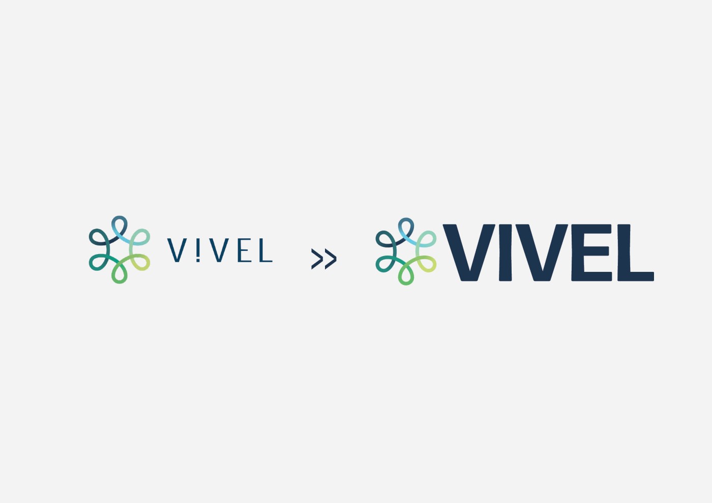
We have been a close-knit team from the start. Our essential vision was to visually bring their core values - collaboration, accessibility and innovation - to life. The old inspired style is dated and no longer fits the energy and ambition of the organization. It was time for something that really blossoms and grows.
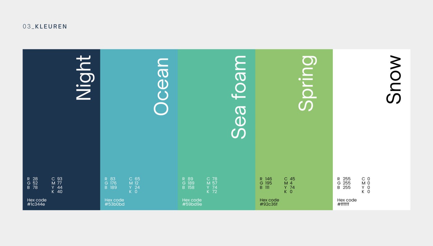
The restyling included a complete remake of the digital platforms and communication tools. We opt for reliable colors and clean lines, so that the new look immediately makes it clear: "We are ready for the future." All this helps to better support and promote VIVEL's various projects, such as caring neighborhoods and prevention programs.
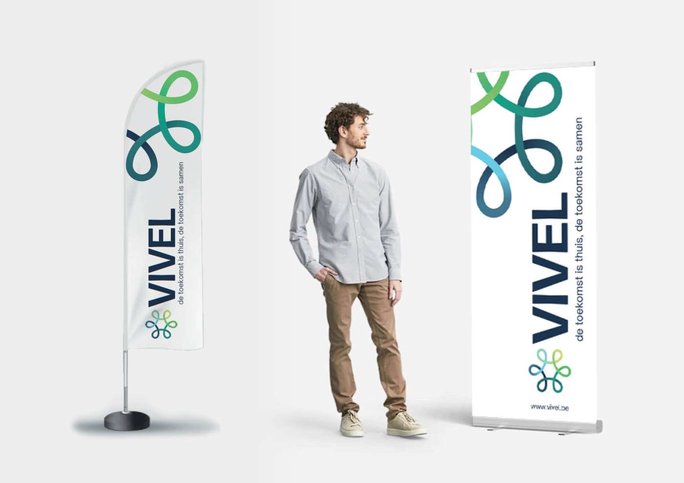
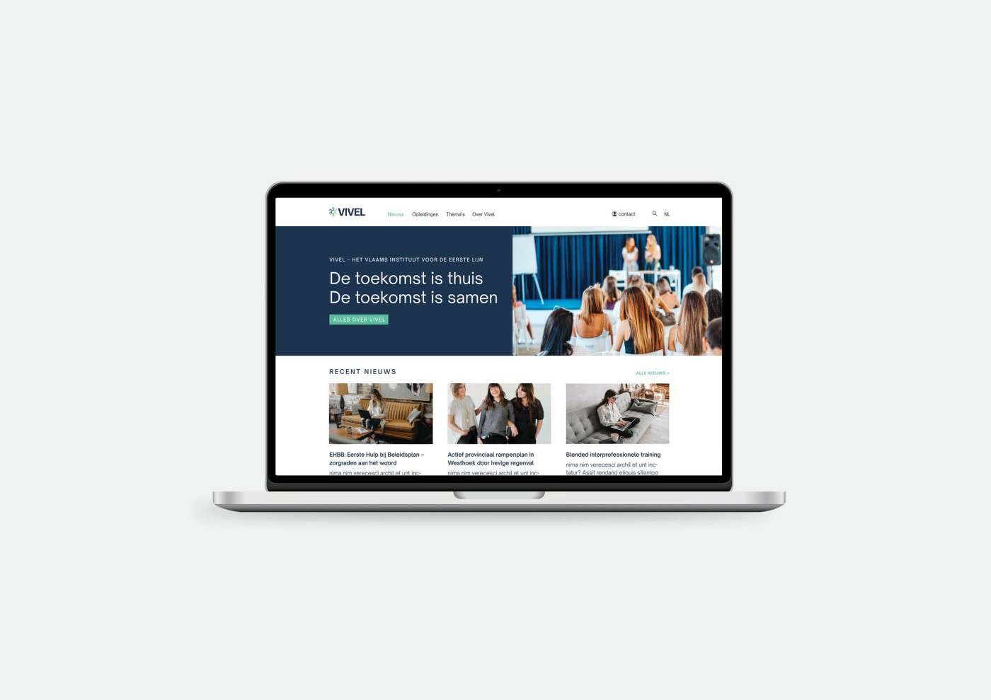
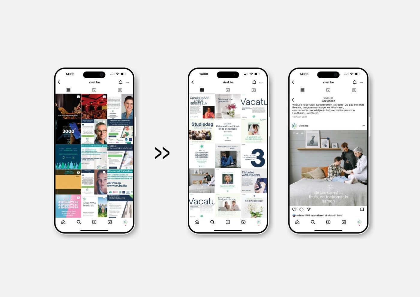
When designing the new corporate identity, user-friendliness was a top priority. We wanted the visual elements to be clear and simple so that everyone, from healthcare providers to volunteers and the general public, felt welcome. The new look is not only visually attractive, but also accessible to all target groups.
Working with the VIVEL team was extremely inspiring. Their commitment and dedication to primary care are admirable. It is an honor to be part of a project that has such a positive impact on the healthcare sector. The new corporate identity strengthens VIVEL's brand identity with a fresh, modern look that fits perfectly with who they are.

