

Mezon Brand Identity Design
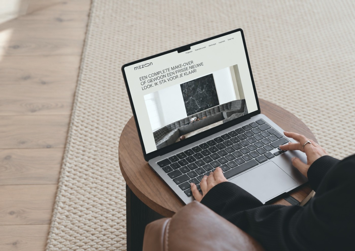
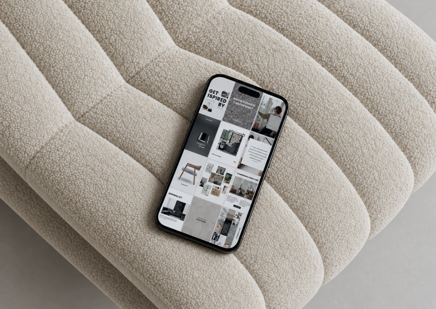
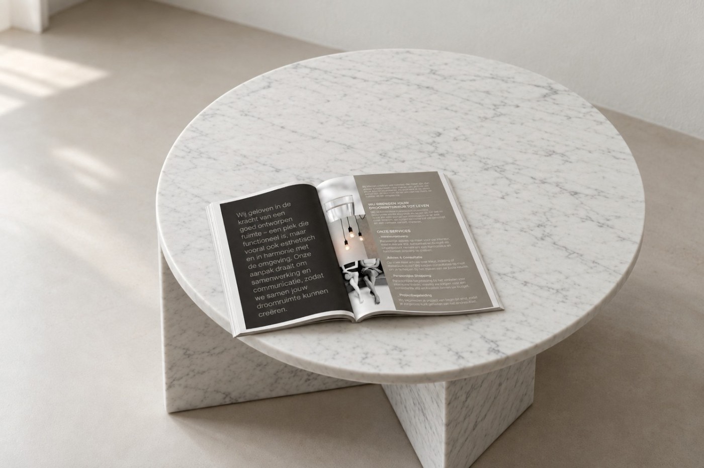
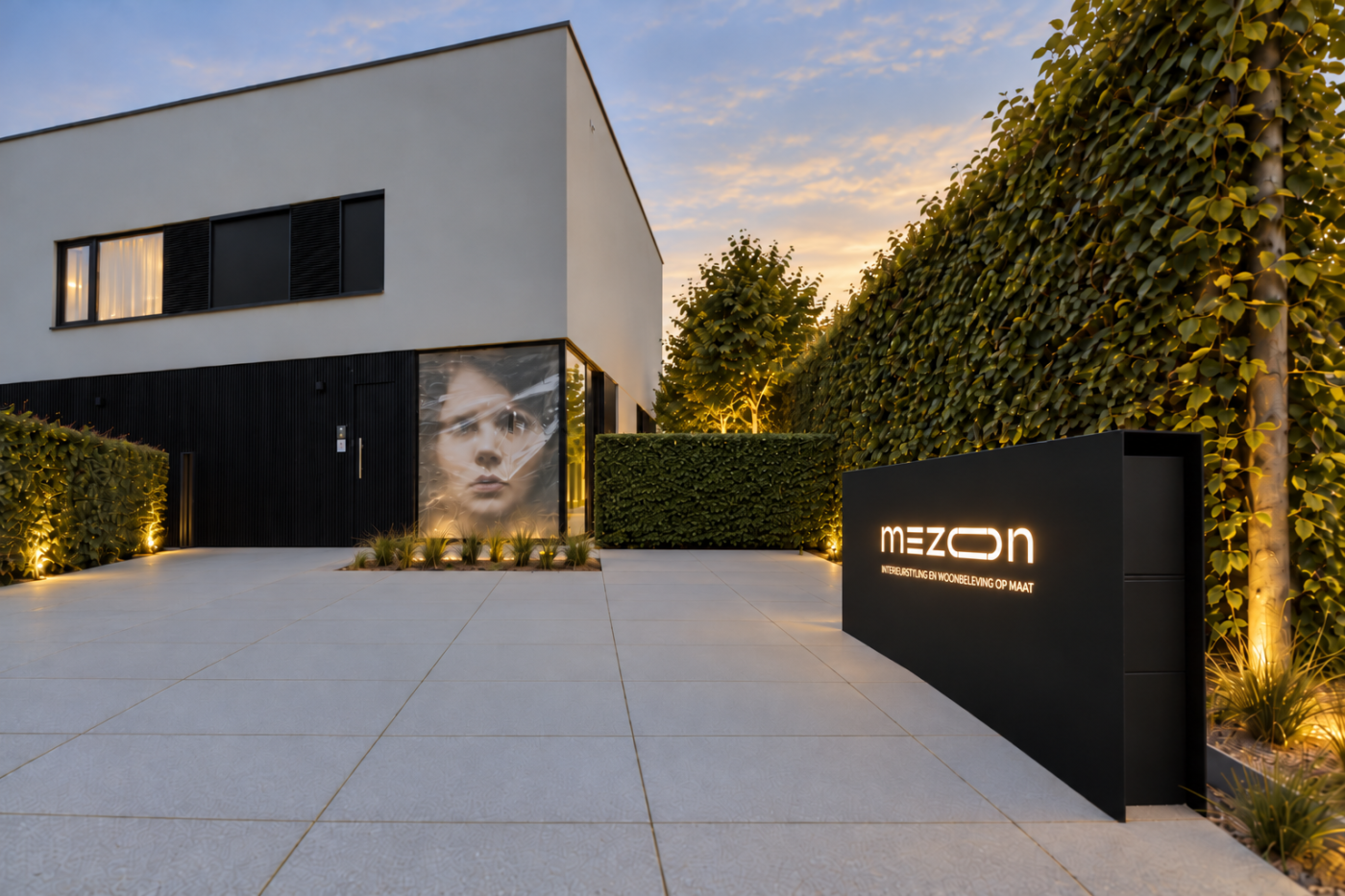
Interior stylist Kathleen Clinckspoor from Brakel harmonizes materials, textures, and objects until a house becomes a home. Her brand needed to evoke that same feeling. I developed the logo and visual identity, extending the style across her brochure, illuminated signage, website, and Instagram.
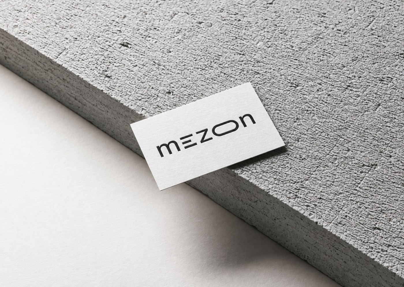
The Mezon logo: an ‘O’ that creates space
‘Mezon’ sounds like *maison*. In the wordmark, the letter ‘O’ stretches into an elongated shape, giving the logo its own unique rhythm. Clean, calm, and instantly recognizable.
Visual identity: from storefront to Instagram feed
Black, a warm off-white, and plenty of breathing room. This consistent aesthetic runs through the brochure, the illuminated signage, the website, and every Instagram post. It ensures that every touchpoint feels like a true reflection of the experience Kathleen offers.
The face of Mezon
A portrait viewed through plastic film. No hidden message—just an image that sticks with you. It appears on the brochure, the storefront, Instagram, and at every trade fair. One image, and you know: this is Mezon.
WANT TO KNOW MORE ABOUT MY APPROACH?
Schedule your appointment here


