ICON Brand Identity Design
ICON is a company that focuses on both industrial services and renewable energy. ICON's duality comes from recognising the growing need for sustainable solutions in both industry and residential construction. In the branding, we sought to capture their commitment to sustainability and innovation in the renewable energy industry. Therefore, the logo's clean design exudes strength, progress and reliability and so does their professionalism.
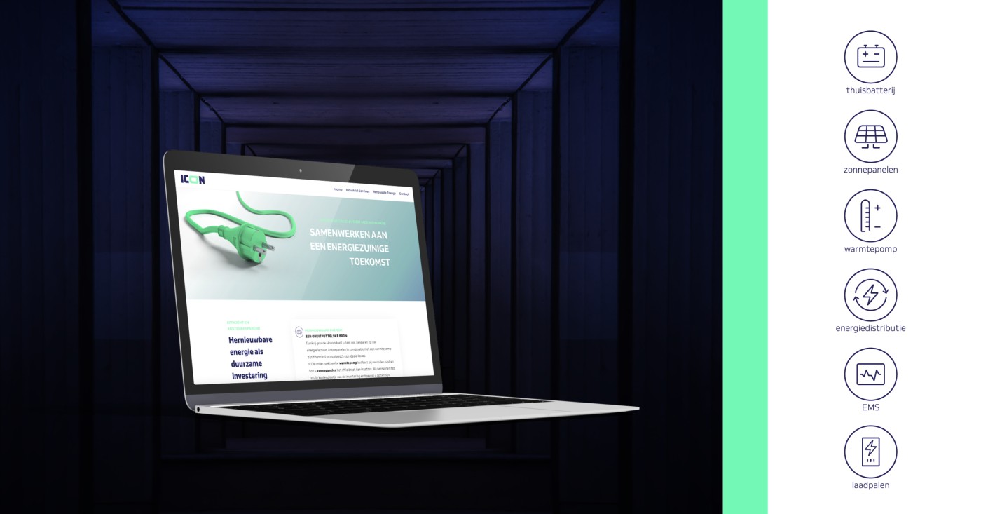
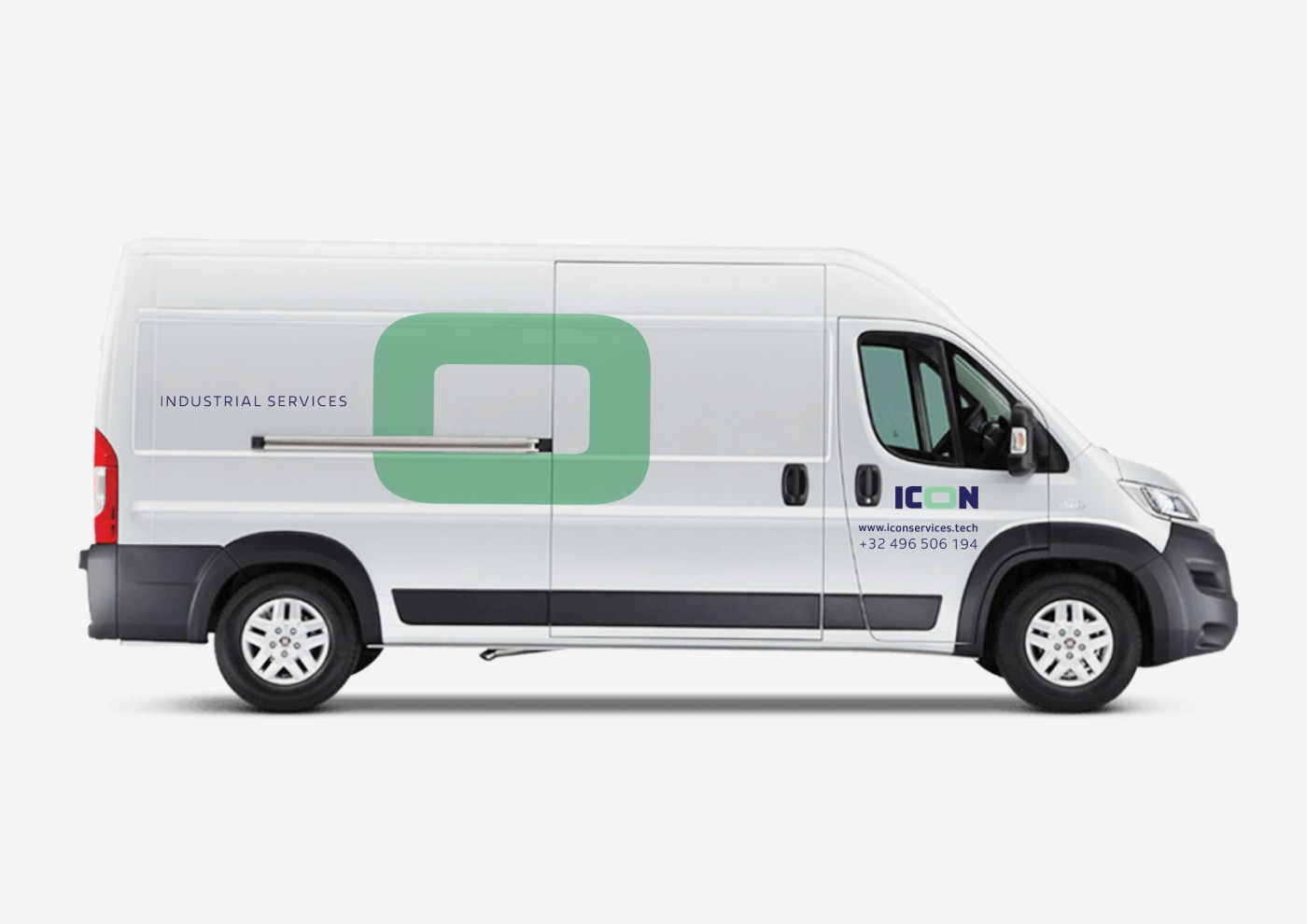
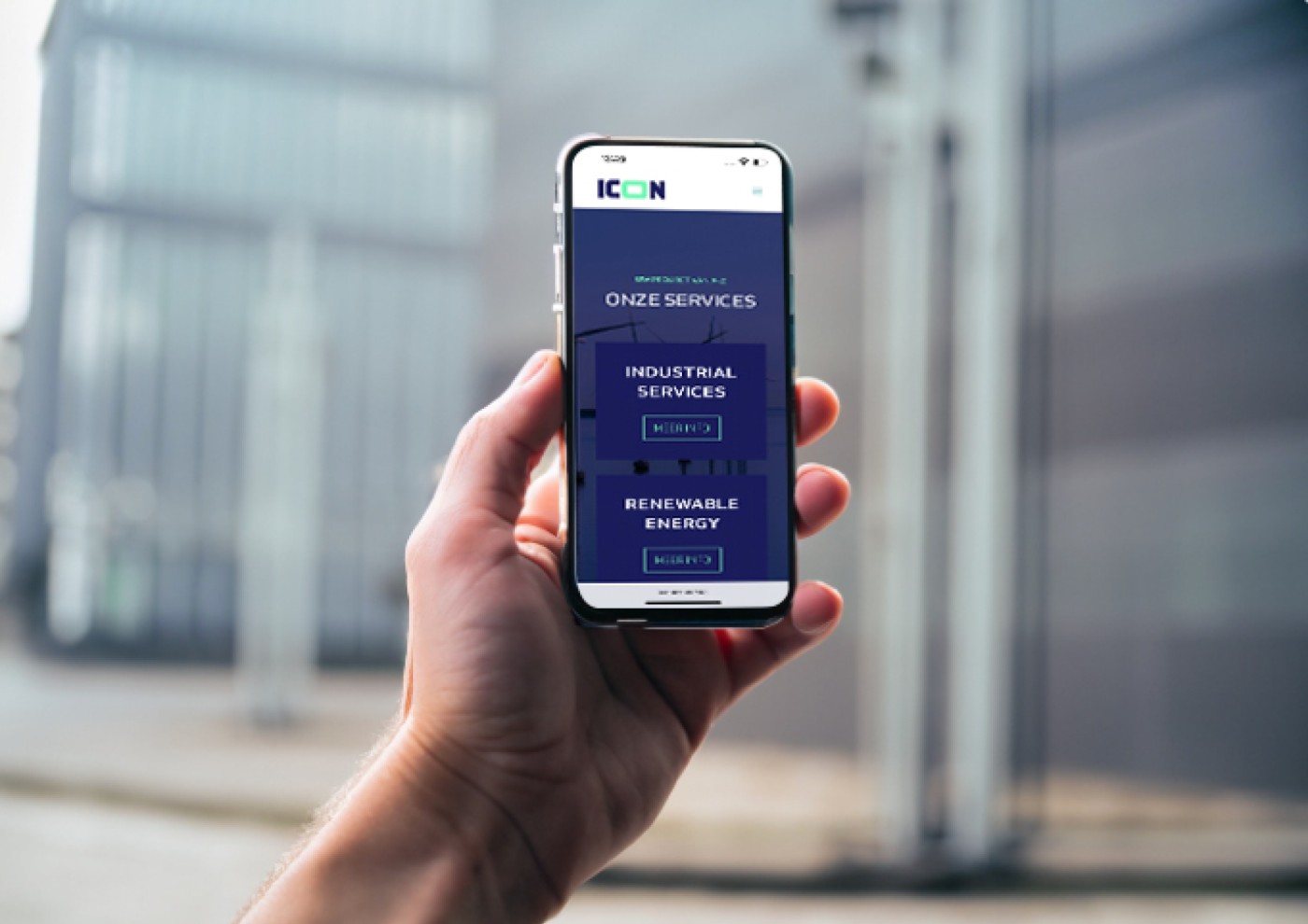
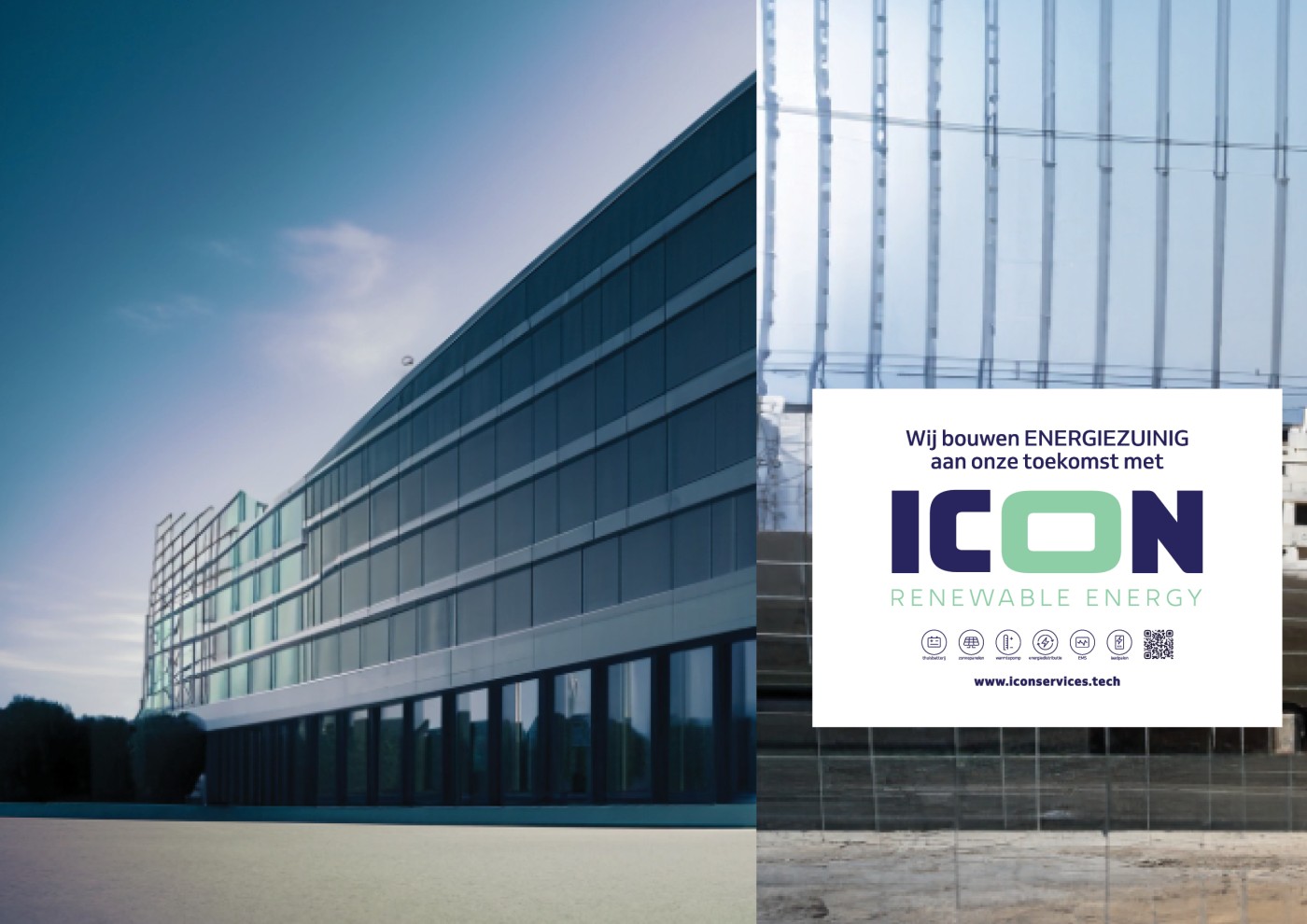
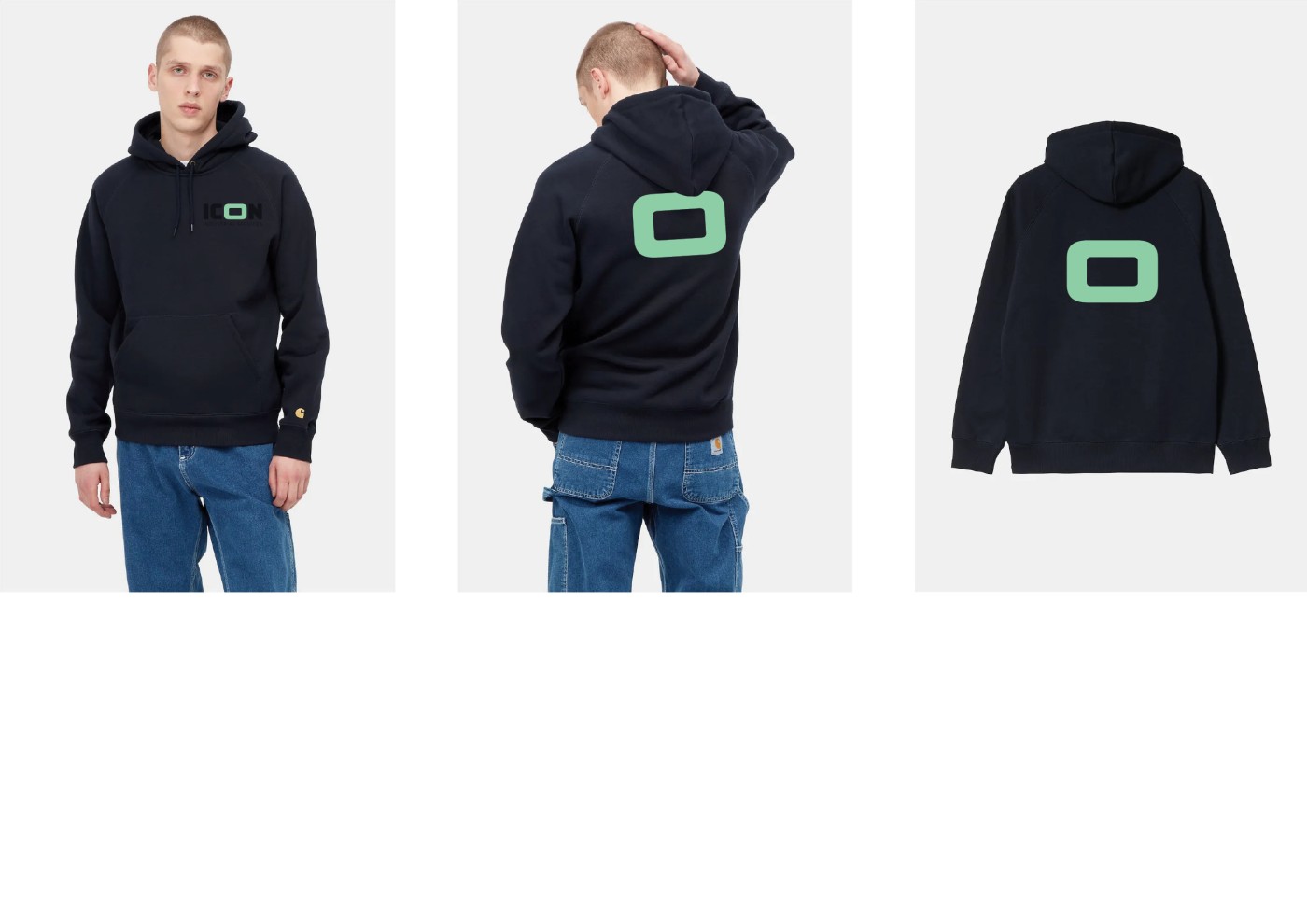
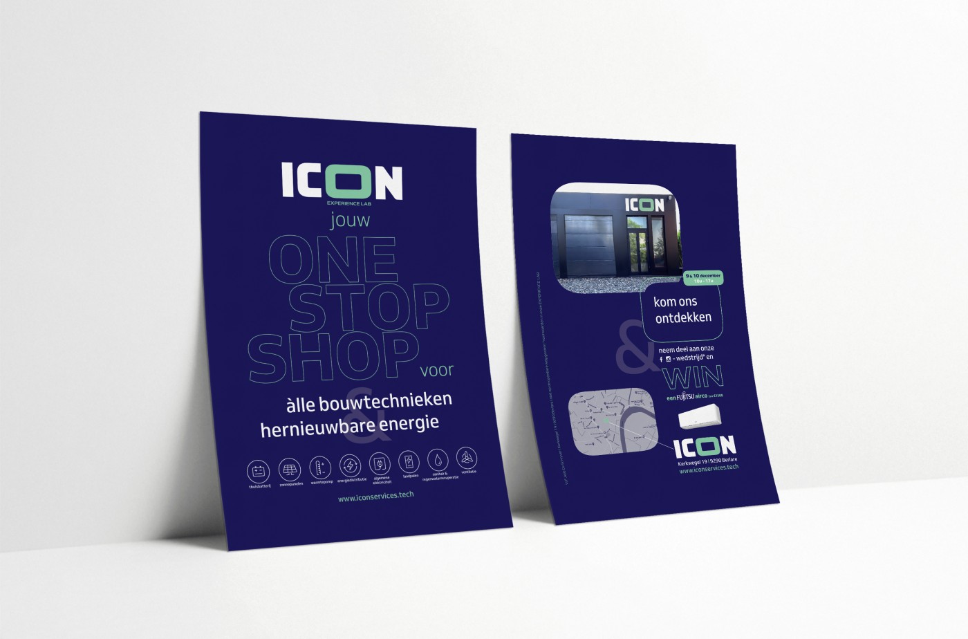
The ICON logo features clean lines and a timeless font that perfectly matches the company’s modern and forward-thinking approach. Using green and blue as colours, which are often associated with renewable energy and nature, the company aims to emphasise its message of energy efficiency and environmental friendliness as well as professionalism. This creates a consistent look that really stands out.

