Why is Volvo restyling its logo?

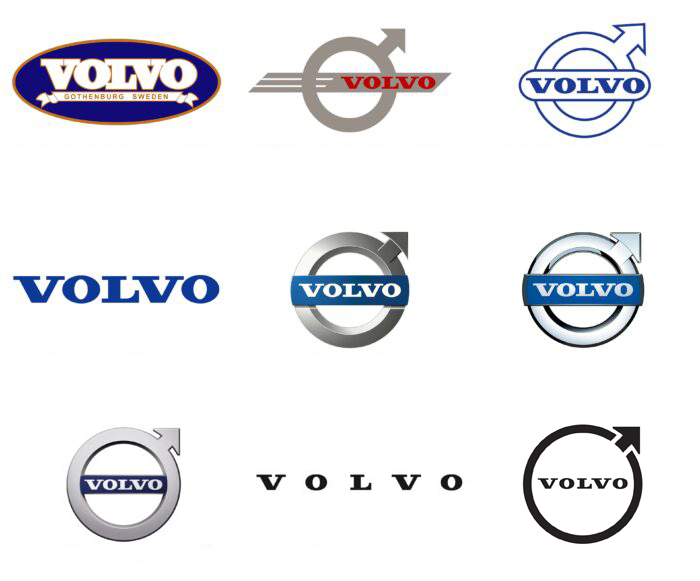
Restyling a logo may seem like a small intervention, but it's not. The global brand is leaving a recognisable image with which its products and its trajectory are related to launch a new one. One that also has to be recognisable and at the same time reflect new goals. This new two-dimensional logo represents the new 'electrical' phase for the company.
Here's an overview of the logo's evolution over its almost 100-year history.

Why should you restyle your logo?
The existing logo no longer suits your company
Your logo is your business card. Your logo should immediately give people a correct image of your company. What do you do, which norms and values do you want to radiate, what do you stand for, ... ?
A growing company is a company in change. So there is a good chance that at some point your logo no longer suits your company. Imagine that Microsoft was still using its old logo. Would the picture still be right in your eyes? And what about the old versus the new logo of Instagram? In both cases, the logo has been renewed, just like the company, just like Volvo is doing now with its electric cars.
When you start your business, a logo seemed like an afterthought
When you start a business, there is a lot that goes into it. Your focus is mainly on the practical side. How do you market your products/services? How much will you invest in your business? Under which name do you want to offer your products/services? The 'packaging' or house style seems to be of minor importance and in order to keep the costs down you might call on an acquaintance who is good at Photoshop to make a logo and a house style. A week later you receive your logo and you can start working.
Only after a while you realise that an appropriate and consistent house style is rather important and that you would have been better off entrusting the design of your logo to a professional. The logo, you now realise, doesn't work and doesn't match what you want to project as a company. Now is the time to call in an experienced designer and update your logo and corporate identity.
You have changed the name of your company
For various reasons it can happen that you change the name of your company. You start a collaboration with another company, you expand your offer or you start focusing on a completely different target group, ... This can be a good time to renew your logo at the same time. Depending on the reason for the name change, there is a fairly good chance that your new company name no longer matches your logo or vice versa. In any case, people will have to get used to the new name. This is the perfect opportunity to introduce a new logo.
Your company has suffered a negative image
You wouldn't wish it on anyone, but it can happen that your company has acquired a bad image. And although the reason for this has long since been clarified, that negative image continues to haunt you. People do not forget easily. In this case, it might be better to start with a clean slate and renew both your company name and logo. Tip: tackle your entire corporate identity at once for a fresh, new start without any negative associations.
Your logo is outdated
Maybe your logo just doesn't 'work' anymore. In a rapidly evolving market, this is not inconceivable. Your logo, which looks so beautiful on paper, is completely meaningless in the digital world. Or you've had enough of your logo. It is no longer fresh and contemporary. Or the opposite: your logo consisted (partly) of your brand name, but in the meantime your company has become so common that you decide to make your logo more abstract. Think for example of the mermaid of Starbucks and the N of Netflix.
So there are many reasons to renew your logo, you don't change it just like that and renewing it too often is not a good plan either. So, think before you leap and discuss it with a professional beforehand.
Discover some of else's designs and restylings here.
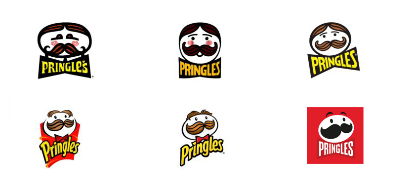
Pringles also changed its logo several times.

The mascot was retained over the years, but always simplified. The first logo, designed in 1967, still had the 'P' of Pringles in the eyes and the brand name itself in the mascot's bow tie. Twenty years later, the designers made the head rounder, the eyes became black dots and a mouth and eyebrows were added. The white collar above the bow tie disappeared. Exactly ten years later, the mouth disappeared along with the pink cheeks, the logo was given softer colours and it was turned a few degrees to the left. However, this new logo lasted only six years. Then Pringles came up with a brand new logo. But again, the brand decided to change its logo after only seven years. Since 2009, a new logo has been used on the packaging. Pringles now resolutely opted for a simplified and modern version of its mascot.

